Views
331
Replies
2
Status
Closed
Adobe has attempted to fix what wasn’t broken.
The new Exchange look reminds me of a throwback to DOS.
Before, the entire selection menu was laid out clearly, simply, logically. There was no guess work. I don’t expect to have to poke around on the Exchange or endure a learning curve, no matter how small. I expect it to be WYSIWYG and so it was – until now. New is not always better. Design, if one can call it that, has replaced good sense in this case.
Adobe, please…

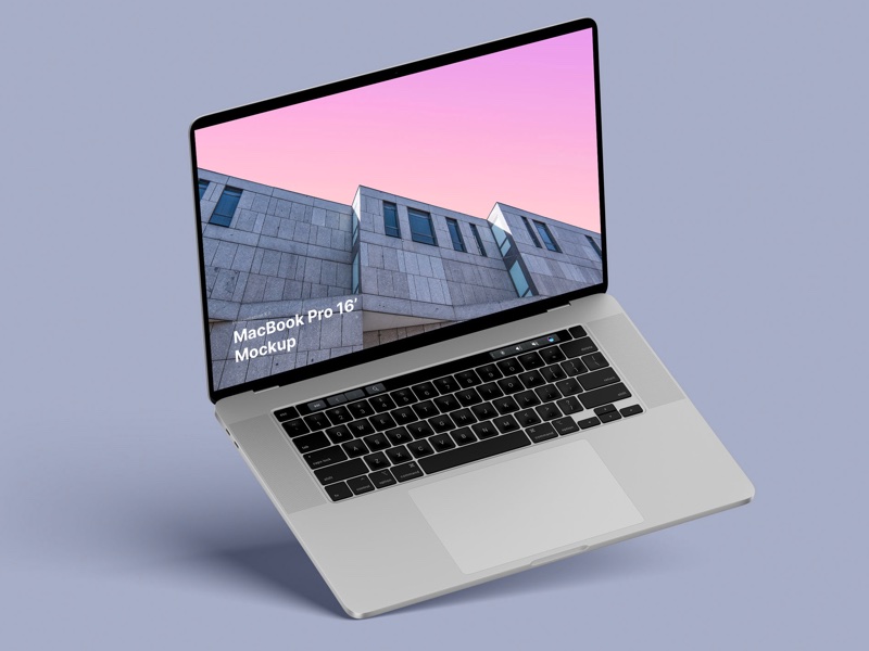
MacBook Pro 16” Mockups 🔥
– in 4 materials (clay versions included)
– 12 scenes
– 48 MacBook Pro 16″ mockups
– 6000 x 4500 px